Principles for Building Successful Component Libraries
Lessons Learned as a Component Library Maintainer

Welcome to my blog 👋🏽
I'm a Front-End Developer with a passion for learning!
I write about Programming 👩🏽💻 and Productivity Tips ✅
ℹ️ Introduction
Reflecting on my journey with component libraries, I've gathered a myriad of insights that I believe can guide others in creating successful component libraries of their own. Working across several libraries in various capacities, each project has taught me something new about what works and what doesn't. Your mileage may vary, but these are some of the lessons I’ve learned being a component library maintainer and contributor.
🚰 Avoid the Kitchen Sink
It's tempting to create a component for every conceivable need, but this can lead to an overwhelming array of choices for developers. For instance, deciding between a HeaderSection or AppSectionHeader can complicate rather than simplify development. The key is to focus on essential components, ensuring that developers aren't bogged down by unnecessary options. Help a dev out and prevent a scenario where it makes their job harder because they have too many components to choose from.
Not every UI element needs to be included in a component library. Create components only when they are needed multiple times and justify the effort of abstraction. Complex components with unique logic should remain presentational, avoiding the inclusion of business logic. This focus ensures that the library remains manageable and relevant in a wide range of scenarios.
🔡 Carefully Craft the Props API
Defining the props that individual components accept are the backbone of any component library. If the initial props structure is too rigid, it becomes challenging to make changes without causing disruption. To mitigate this, it's vital to design a flexible and robust API from the start. Changes should be additive, not subtractive, to avoid breaking existing implementations. This foresight ensures that your components remain adaptable and easy to integrate with third-party libraries, without being tied to specific implementations.
Another thing to keep in mind when crafting props is to make impossible states impossible. This means structuring your component's API so that it inherently disallows invalid or contradictory configurations. By doing so, you reduce the likelihood of bugs and make your components more robust.
♿ Prioritize Accessibility
Accessibility should always be a priority. By implementing accessible components from the beginning, applications can make meaningful strides in creating a more inclusive user experience (UX). This ensures that even developers with limited accessibility expertise can effectively use these components. Such an approach not only enhances UX but also simplifies development by offering accessible building blocks.
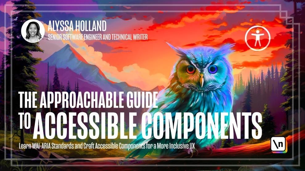
Check out my course, The Approachable Guide to Accessible Components, to learn more about this topic.
🤸🏽♀️ Emphasize Flexibility and Extensibility
Components should be developed with a focus on flexibility and extensibility. Avoid imposing fixed dimensions unless absolutely necessary, as this allows components to adapt to different layouts and design changes.
For example, if the initial design calls for a component to be centered within a container, but later the design changes so that it needs to grow and take up the full width of said container, this change becomes trivial if the component was built in such a way that it was unopinionated about its dimensions from the start.
To prevent components from causing unintended layout shifts, avoid applying margins to the outermost container of the component. Using padding is acceptable as it only affects the internal spacing of the parent component. Ensuring that components can expand to fit their container makes them adaptable to various applications.
📝 Document Thoroughly
When it comes to component libraries, developers are your audience. Help them out by writing comprehensive documentation. Tools like Storybook and React Styleguidist can help with creating detailed documentation, making it easier for developers to effectively utilize components.
📶 Extend HTML Element Attributes
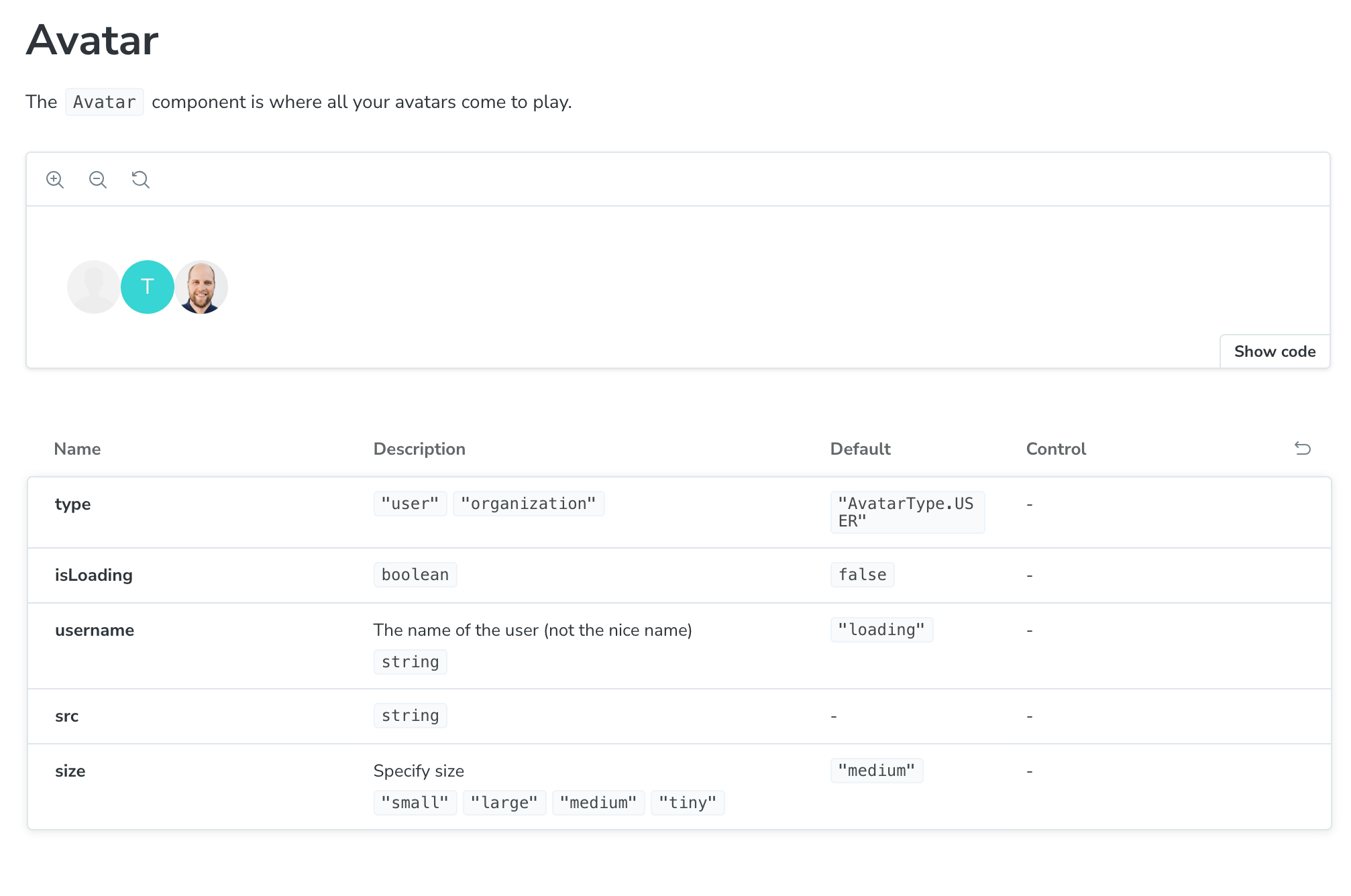
When implementing components that have native HTML equivalents, it's helpful to expose props that extend the element's attributes. Common HTML elements added to component libraries include the <button>, <textarea>, and <input>.
For example, if you were to create a custom TextInput component in React, you might define props that looks something like the following code block:
import "./TextInput.css";
import PropTypes from "prop-types";

TextInput.propTypes = {
  id: PropTypes.string.isRequired,
  label: PropTypes.string.isRequired,
  hideLabel: PropTypes.bool,
  disabled: PropTypes.bool, // <input> attribute
  error: PropTypes.string,
  type: PropTypes.string, // <input> attribute
  name: PropTypes.string, // <input> attribute
  placeholder: PropTypes.string, // <input> attribute
  value: PropTypes.string.isRequired, // <input> attribute
  onChange: PropTypes.func.isRequired
};

export default function TextInput(props) {
  const { id, label, disabled, hideLabel, error, name, value,
          type = "text", placeholder, onChange } = props;

  const hasError = error?.length > 0;
  return (
    <div>
      <label htmlFor={id} className={hideLabel ? "visually-hidden" : null}>
        {label}
      </label>
      <input
        id={id}
        type={type}
        placeholder={placeholder}
        name={name}
        disabled={disabled}
        value={value}
        aria-describedby={hasError ? "error-message" : null}
        aria-invalid={hasError ? "true" : "false"}
        onChange={(event) => onChange?.(event.target.value)}
      />
      {hasError && (
        <p id="error-message" className="error">
          {error}
        </p>
      )}
    </div>
  );
}
By using the same names as the equivalent HTML elements, developers can more easily adopt the custom component without needing to learn an entirely new API.
🔝Leverage Headless Libraries
Headless components offer a powerful abstraction by providing logic and accessibility without styling. This allows developers to apply their own branding while benefiting from pre-built functionality. These libraries are particularly useful for complex components, enabling developers to focus on meeting design requirements rather than reinventing the wheel.
Check out this YouTube video to learn more about how to implement an accessible Tabs component using Radix:
El Fin 👋🏽
Building a successful component library involves thoughtful architecture, striking a balance of restraint and flexibility, and a strong emphasis on accessibility and documentation. By adhering to these best practices, you can develop a library that is both practical and extensible, effectively meeting the needs of developers throughout your company.
If you enjoy what you read, feel free to like this article or subscribe to my newsletter, where I write about programming and productivity tips.
As always, thank you for reading, and happy coding!