Building a Component Library with Radix
My Guest Post on LogRocket

Welcome to my blog 👋🏽
I'm a Front-End Developer with a passion for learning!
I write about Programming 👩🏽💻 and Productivity Tips ✅
Radix is an open-source library that provides components for building accessible, high-quality React web applications and design systems. Radix is part of a new wave of headless components being created in the frontend space, and this pattern has been gaining a lot of traction lately.
This guide aims to provide you with a deeper understanding of Radix and how it can be used to build out design systems and component libraries. The latter half of this article provides an in-depth tutorial on building a sample component library with Radix Primitives. 🎨
Radix overview
Radix is composed of a suite of three products: Primitives, Colors, and Icons. These tools can be used to build out design systems. Let’s take a closer look at each individual product and how they can be used separately or collaboratively to suit your needs.
Primitives
Radix Primitives is the library’s flagship product. It is described as a collection of “unstyled, accessible components for building high‑quality design systems and web apps in React.” Instead of reinventing the wheel, Radix Primitives handle a lot of the tricky parts when it comes to building out common component patterns.
Building out accessible widgets that meet the WAI-ARIA standards and properly handle aspects like keyboard navigation can be a large undertaking. Libraries like Radix aim to simplify this often difficult process for developers by providing a set of flexible and extensible components that are prebuilt with accessibility and developer experience in mind.
Colors
Radix Colors is a carefully crafted color system designed for building stunning web apps. It provides additional features like automatic dark mode compatibility which makes switching to a dark theme as simple as applying a class to a container, the ability to compose color palettes to work with your app’s brand or theme, and accessibility considerations that are guaranteed to pass WCAG contrast ratio requirements.
Radix Colors provides a set of scales that are JavaScript objects intended to integrate with your preferred styling solution, ranging from vanilla CSS to CSS-in-JS options (e.g., styled-components).
Icons
Radix Icons touts itself as a “crisp set of 15x15 icons designed by the WorkOS team.” All the icons are available as individual components that can be installed via a single package.
Simply import the respective icons, and you can add them to your apps like you would any other React component. Radix Icons are also available in other forms like downloadable SVGs, along with Figma and Sketch files.
Design systems vs. component libraries
I often see the terms design system and component library used interchangeably. Although these two concepts are related, they pertain to different parts of a larger whole.
In an effort to diffuse any confusion, I’ll define each term to point out the distinction and differences between the two related terminologies.
Design systems
The Nielsen Norman Group, a renowned and trusted UX research and consulting firm, defines a design system as a “…set of standards to manage design at scale by reducing redundancy while creating a shared language and visual consistency across different pages and channels.”
A typical design system may consist of the following three items:
Style guide: A standard of how elements should look and feel across a suite of products or websites. The most common type of style guide relates to brand design which involves elements like fonts, typography, colors, and logos
Pattern library: Typically includes templates and layout structures intended to provide general workflow patterns; the patterns established are meant to be reused and adapted throughout an application
Component library: Sometimes referred to as UI libraries or UI kits
Some examples of popular design systems include Google’s Material Design, the Atlassian Design System, and Carbon Design System by IBM.
Component libraries
A component library consists of a collection of UI elements (i.e., components) that can be reused across an application. These components implement the design standards established throughout the style guide.
Due to their composability, components make it easier to implement wireframes provided by a design team. Common components found in a library range from buttons and individual form elements (e.g., inputs, checkboxes, etc.) to more complex elements like date pickers.
Some examples of popular component libraries include MUI (the artist formerly known as Material UI), Headless UI by Tailwind Labs, and of course Radix UI.
Because a design system is a large entity that often involves multiple stakeholders across varying fields, building one is quite an arduous feat. In an effort to keep this article digestible, we will build out a component library as a subset of a design system. However, it is important to note that Radix offers a full suite of tools that provide you with the resources to build out full-fledged design systems.
Installing and setting up the sample project
Documentation within a UI library is imperative because it provides a single location where developers and designers alike can view a list of the components within a design system. Developers can also leverage this documentation as a sandbox environment where they can test out components in multiple states and read up on the different properties that can be used to customize an individual component.
Because documentation is so important, our sample project has been preconfigured with React Styleguidist, a development environment for building React components. We’ll use this tool to document the components as we build them out.
To clone the radix-component-library project from GitHub, open your terminal and run the following command:
git clone https://github.com/Cool-Runningz/radix-component-library.git
Next, cd into the radix-component-library folder:
cd radix-component-library
Install the project dependencies defined in the package.json file:
npm install
Once the installation is completed, start the development server:
npm run library
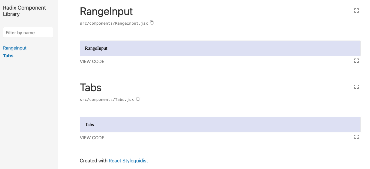
Navigate to http://localhost:3020/ in your browser. You should see the following screen:
Now that we have the project up and running, we can begin to incorporate Radix into our component library.
Building a range input component with Radix
The first component we will build is a range input that adheres to the WAI-ARIA slider design pattern.
I've written before about how creating a custom range input that looks consistent across all browsers can be an arduous task. However, Radix makes this process simpler by providing a Slider Primitive. The range input is sometimes referred to as a slider; throughout the rest of this article, I will use these terms interchangeably.
In Radix, each Primitive can be installed individually so you can adopt them incrementally. Primitives are also versioned independently, to further facilitate incremental adoption. This leads to less bloat in your codebases, as you only need to import the individual components that you need.
Installation and boilerplate
To build a range input component, start by installing the Slider Primitive:
npm install @radix-ui/react-slider
Next, open the RangeInput.jsx file, import the Radix Primitive, and add the boilerplate for the slider component. At this point, your file should include the following code:
import React from 'react'
import PropTypes from "prop-types"
import "./RangeInput.css"
import * as SliderPrimitive from '@radix-ui/react-slider';

const RangeInput = (props) => {
    return (
        <SliderPrimitive.Root className="rootSlider" value={props.value}>
            <SliderPrimitive.Track className="trackSlider">
                <SliderPrimitive.Range className="rangeSlider" />
            </SliderPrimitive.Track>
            <SliderPrimitive.Thumb className="thumbSlider"  />
        </SliderPrimitive.Root>
     )
}
export default RangeInput
The anatomy of a Slider component in Radix consists of the following four elements:
Root: Contains all the parts of a slider
Track: The track that contains the
Slider.RangeRange: The range part that must be contained inside
Slider.TrackThumb: A draggable thumb
At this point, if you navigate to http://localhost:3020/#rangeinput you’ll notice that the UI is empty. This is because Radix components do not apply any styles by default.
Next, we’ll go through the process of adding CSS to the custom component.
Styling the component
Radix is not opinionated about how to style components and it is compatible with a variety of CSS solutions, providing you with complete control over styling.
Using plain ol’ CSS, we’ll style to RangeInput component to match the one found in the “Estimate your cost - Professional” section of LogRocket’s Pricing page:
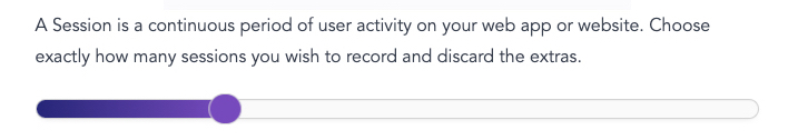
Slider from LogRocket’s “Pricing” page.
Root
The Root contains all the parts of a slider and it will render an input for each thumb.
Create a .rootSlider class in RangeInput.css and add the following code:
.rootSlider {
   display: flex;
   align-items: center;
   position: relative;
   height: 1.5rem;
   max-width: 30rem;
}
Track
The Track contains the Slider.Range and is the part of the slider that the thumb runs along.
Create a .trackSlider class in RangeInput.css and add the following code:
.trackSlider {
   background-color: #fafafa;
   border: 1px solid #d3d3d3;
   position: relative;
   flex-grow: 1;
   border-radius: 10px;
   height: 1rem;
}
Range
The Range must live inside Slider.Track and represents the range of values that are selected.
Create a .rangeSlider class in RangeInput.css and add the following code:
.rangeSlider {
   position: absolute;
   background: linear-gradient(90deg,#252678,#764abc);
   height: 100%;
   border-radius: 10px;
}
Thumb
The Thumb is the element on the track that the user can move around to select varying range values.
Create a .thumbSlider class in RangeInput.css and add the following code:
.thumbSlider {
   display: block;
   width: 20px;
   height: 20px;
   background-color: #764abc;
   border-radius: 30px;
   border: 1px solid #d9d9d9;
}

.thumbSlider:hover {
   cursor: pointer;
}

.thumbSlider:focus {
   outline: 1px solid white;
}
With all these styles applied, if you navigate back to http://localhost:3020/#rangeinput you should see the following being rendered:
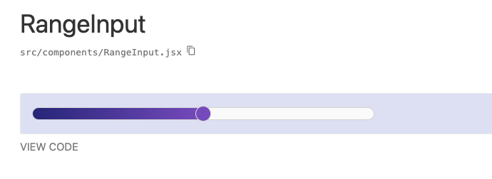
RangeInput with CSS applied.
Adding props
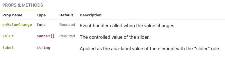
The last step of building the RangeInput component is to configure it to be able to accept props, which in turn will make it more reusable and customizable. For this example, we‘ll add three props:
label: Applied as the aria-label value for the element with thesliderrolevalue: Represents the controlled value of the slider and must be used in conjunction withonValueChangeonValueChange: The event handler that gets called when the value changes
Radix components can be controlled or uncontrolled. Adding the value and onValueChange props will turn the RangeInput into a controlled component.
The markdown file that renders the RangeInput in the sandbox environment has been preconfigured to pass in props. Now we need to update the component to be able to handle those props.
First, we need to add typechecking with PropTypes. The prop-types library has already been imported near the top of RangeInput.jsx so now you can add the propTypes definition at the bottom of the file, like so:
RangeInput.propTypes = {
  /** Applied as the aria-label value of the element with the "slider" role  */
  label: PropTypes.string.isRequired,
  /** The controlled value of the slider. */
  value: PropTypes.arrayOf(PropTypes.number).isRequired,
  /** Event handler called when the value changes. */
  onValueChange: PropTypes.func.isRequired
}
When propTypes are present, React Styleguidist will pick up the props from the object’s declarations and display them in a table. Now, anyone looking at this example will know the exact props that are needed to properly implement this component.
React Styleguidist props table.
Next, we want to update the JSX within RangeInput.jsx to be able to pass the props to the RangeInput component. The value and onValueChange props need to get applied to the SliderPrimitive.Root element, while the label prop needs to get applied to the SliderPrimitive.Thumb element.
With those updates, the RangeInput.jsx file should now contain the following code:
import React from 'react'
import PropTypes from "prop-types"
import "./RangeInput.css"
import * as SliderPrimitive from '@radix-ui/react-slider';

const RangeInput = (props) => {
   return (
      <SliderPrimitive.Root className="rootSlider"
           value={props.value} onValueChange={props.onValueChange}>
           <SliderPrimitive.Track className="trackSlider">
                <SliderPrimitive.Range className="rangeSlider" />
            </SliderPrimitive.Track>
            <SliderPrimitive.Thumb className="thumbSlider" aria-label={props.label}
           />
       </SliderPrimitive.Root>
    )
}
export default RangeInput

RangeInput.propTypes = {
 /** Applied as the aria-label value of the element with the "slider" role  */
 label: PropTypes.string.isRequired,
 /** The controlled value of the slider. */
 value: PropTypes.arrayOf(PropTypes.number).isRequired,
 /** Event handler called when the value changes. */
 onValueChange: PropTypes.func.isRequired
}
Voila!
With minimal code, we were able to leverage the Radix Slider to create an accessible and functional RangeInput component that is styled to match the LogRocket theme.
Next, we’ll demonstrate how to implement one more component for our UI library.
Building a tabs component with Radix
The second component we will build is a Tabs element that leverages the Radix Tabs Primitive. This component is constructed to adhere to the WAI-ARIA Tabs design pattern.
Installation and boilerplate
First, install the Tabs Primitive:
npm install @radix-ui/react-tabs
Next, open the Tabs.jsx file, import the Radix Primitive, and add the boilerplate for the Tabs component.
Your file should include the following code:
import React from 'react'
import PropTypes from "prop-types"
import "./Tabs.css"

import * as TabsPrimitive from "@radix-ui/react-tabs";

const Tabs = (props) => {
   return (
      <TabsPrimitive.Root>
           <TabsPrimitive.List>
                <TabsPrimitive.Trigger value="tab1">Tab 1</TabsPrimitive.Trigger>
                 <TabsPrimitive.Trigger value="tab2">Tab 2</TabsPrimitive.Trigger>
            </TabsPrimitive.List>
            <TabsPrimitive.Content value="tab1">
                    Content for Tab # 1
            </TabsPrimitive.Content>
            <TabsPrimitive.Content value="tab2">
                    Content for Tab # 2
            </TabsPrimitive.Content>
        </TabsPrimitive.Root>
   )
}

export default Tabs
The anatomy of a Radix Tabs component consists of the following four elements:
Root: Contains all the
Tabscomponent partsList: Contains the triggers that are aligned along the edge of the active content
Trigger: The button that activates its associated content
Content: Contains the content associated with each trigger
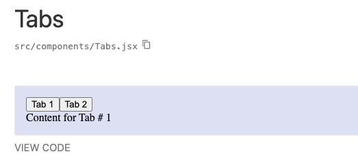
If you navigate to http://localhost:3020/#tabs, the default version of the component should display like this:
Tabs component without CSS.
Adding props
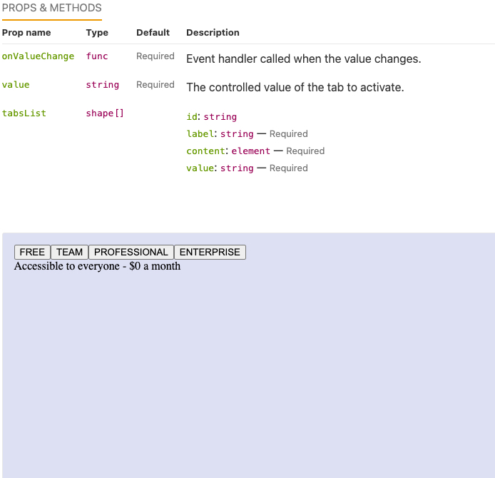
Next, we need to configure the Tabs component to be able to accept props. For this example, we’ll add three props:
tabsList: Array of tabs to be displayedvalue: Controlled value of the tab to activate; this should be used in conjunction withonValueChangeonValueChange: Event handler called when the value changes
Currently, the Tabs component only displays a fixed number of tabs with hardcoded values. In an effort to make the component more flexible so that it can render an arbitrary number of tabs, we will update the JSX in Tabs.jsx with the following code:
import React from 'react'
import PropTypes from "prop-types"
import "./Tabs.css"
import * as TabsPrimitive from "@radix-ui/react-tabs";

const Tabs = (props) => {
    return (
       <TabsPrimitive.Root
             className="rootTabs"
              value={props.value}
              onValueChange={props.onValueChange}
         >
         <TabsPrimitive.List className="listTabs">
               {props.tabsList.map((tab) => {
                    return (
                       <TabsPrimitive.Trigger className="triggerTabs"
                            key={tab.id || `${index}-${tab.value}`}
                            value={tab.value}
                        >
                            {tab.label}
                        </TabsPrimitive.Trigger>);
                   })}
             </TabsPrimitive.List>
             {props.tabsList.map((tab) => {
                 return (
                    <TabsPrimitive.Content className="contentTabs"
                         key={tab.id || `${index}-${tab.value}`}
                          value={tab.value}
                     >
                         {tab.content}
                    </TabsPrimitive.Content>
                  );
             })}
        </TabsPrimitive.Root>
    )
}

export default Tabs

Tabs.propTypes = {
    tabsList: PropTypes.arrayOf(
        PropTypes.shape({
            id: PropTypes.string,
            label: PropTypes.string.isRequired,
            content: PropTypes.element.isRequired,
             value: PropTypes.string.isRequired
         })
    ),
   /** The controlled value of the tab to activate. */
   value: PropTypes.string.isRequired,
   /** Event handler called when the value changes. */
   onValueChange: PropTypes.func.isRequired
}
Tabs.md has been pre-configured to pass in an array of items to the tabsList prop. When we navigate to http://localhost:3020/#tabs, we should see the following:
Tabs with props.
Styling the component
Similar to the previous component, we’ll use vanilla CSS to style the Tabs component to match the one found in the “Estimate your cost” section of LogRocket’s Pricing page:

Tabs from LogRocket’s “Pricing” page.
Root
The Root contains all the elements that are contained within the tabs component.
Create a .rootTabs class in Tabs.css and add the following code:
.rootTabs {
  background-color: white;
}
List
The List contains all the Trigger elements.
Create a .listTabs class in Tabs.css and add the following code:
.listTabs {
   align-items: center;
   display: flex;
   justify-content: center;
   margin: 0 auto;
   width: 85%;
}
Trigger
The Trigger is the button that controls displaying the contents of the selected tab.
Create a .triggerTabs class in Tabs.css and add the following code:
.triggerTabs {
   color: #764abc;
   font-family: "Avenir";
   background: none;
   border: none;
   display: block;
   cursor: pointer;
   font-size: 20px;
   font-weight: 500;
   opacity: 0.5;
   padding: 30px;
   position: relative;
}

.triggerTabs[data-state="active"] {
  opacity: 1;
}

.triggerTabs[data-state="active"]::after {
  background-color: #764abc;
  border-radius: 12px;
  bottom: -4px;
  content: "";
  height: 6px;
  left: 0;
  position: absolute;
  width: 100%;
}
Content
The Content contains the content that is associated with each tab.
Create a .contentTabs class in Tabs.css and add the following CSS:
.contentTabs {
  border-top: 3px solid hsla(0, 0%, 44%, 0.15);
  padding: 30px 55px;
}
With all those styles applied, if you navigate back to http://localhost:3020/#tabs you should now see the following being rendered:
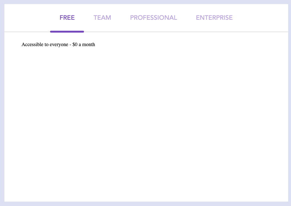
Tabs with CSS applied.
This completes the second example and shows how you can leverage the Radix Tabs Primitive to quickly build a functional and accessible Tabs component that is styled to match the LogRocket theme.
Conclusion
In this article, we investigated Radix and discussed how you can use its suite of products to create design systems. Building incrementally, we used Radix Primitives to develop a basic component library as a subset of a design system.
Developing custom components can be tricky, and incorporating features like accessibility and keyboard navigation can exponentially increase complexity, further validating the benefits of leveraging tools like Radix that aim to simplify this process.
The repository for the component library developed in this article can be found on my GitHub. In addition, you can view a deployed version of the final project here.
Thank you for reading, and happy coding!
ℹ️ This article was originally published on LogRocket's blog.